Visualising data
RStudio project
Open the RStudio project that we created in the previous session. We recommend to use this RStudio project for the entire course and within the RStudio project create separate R scripts for each session.
- Create a new empty R script by going to the tab “File”, select “New
File” and then “R script”. In the new R script, type
# Session 5: Visualising dataand save the file in your folder “scripts” within your project folder, e.g. as “5_Visualisation.R”
1 Base graphics in R
R has many base functions for plotting graphics. So-called high-level graphic functions produce complete, independent graphics such as boxplots, histograms or scatterplots along with axes labels and titles. You can modify these according to your needs by optional arguments, e.g. labels, line widths, point symbols, colours.
Basic R comes with several exemplary data sets - type
data() to see a list of these. The iris data
set gives, for example, the measurements in centimeters of the variables
sepal length and width and petal length and width, respectively, for 50
flowers from each of 3 iris species (see also the help file). We load
the dataset by using the aforementioned function data() and
the name of the dataset.
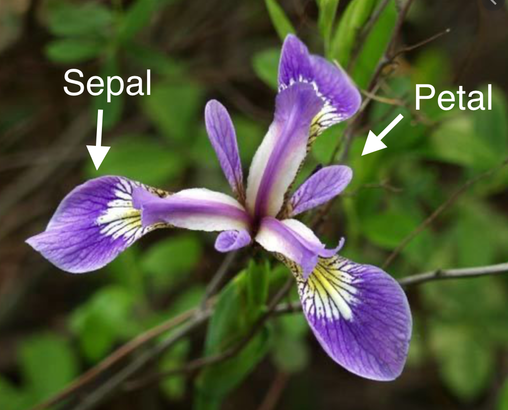
I. setosa flower.
str(iris) # gives you an overview over the structure/content of the data set## 'data.frame': 150 obs. of 5 variables:
## $ Sepal.Length: num 5.1 4.9 4.7 4.6 5 5.4 4.6 5 4.4 4.9 ...
## $ Sepal.Width : num 3.5 3 3.2 3.1 3.6 3.9 3.4 3.4 2.9 3.1 ...
## $ Petal.Length: num 1.4 1.4 1.3 1.5 1.4 1.7 1.4 1.5 1.4 1.5 ...
## $ Petal.Width : num 0.2 0.2 0.2 0.2 0.2 0.4 0.3 0.2 0.2 0.1 ...
## $ Species : Factor w/ 3 levels "setosa","versicolor",..: 1 1 1 1 1 1 1 1 1 1 ...Now, start with visualizing only the data for one of the three
species from the data set: I. setosa. The function subset()
can be used to subset a data set based on certain conditions. The subset
is then assigned to a new object with <-
# this creates a subset of all the data with 'setosa' in the 'Species' column
setosa <- subset(iris, Species == "setosa")
We now make very simple scatterplots using only the data for I. setosa.
# explicitly provide x and y axis. Use the $ sign to indicate which column of the dataset you want to use
plot(x = setosa$Sepal.Width, y = setosa$Sepal.Length)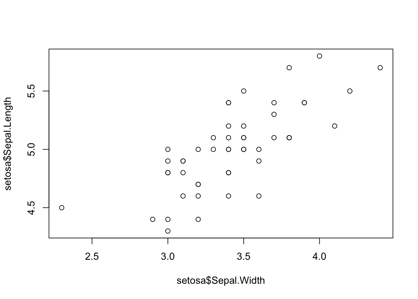
# the formula method allows you to add the named argument for data. This is not possible for the previous plot function call.
plot(Sepal.Length ~ Sepal.Width, data=setosa)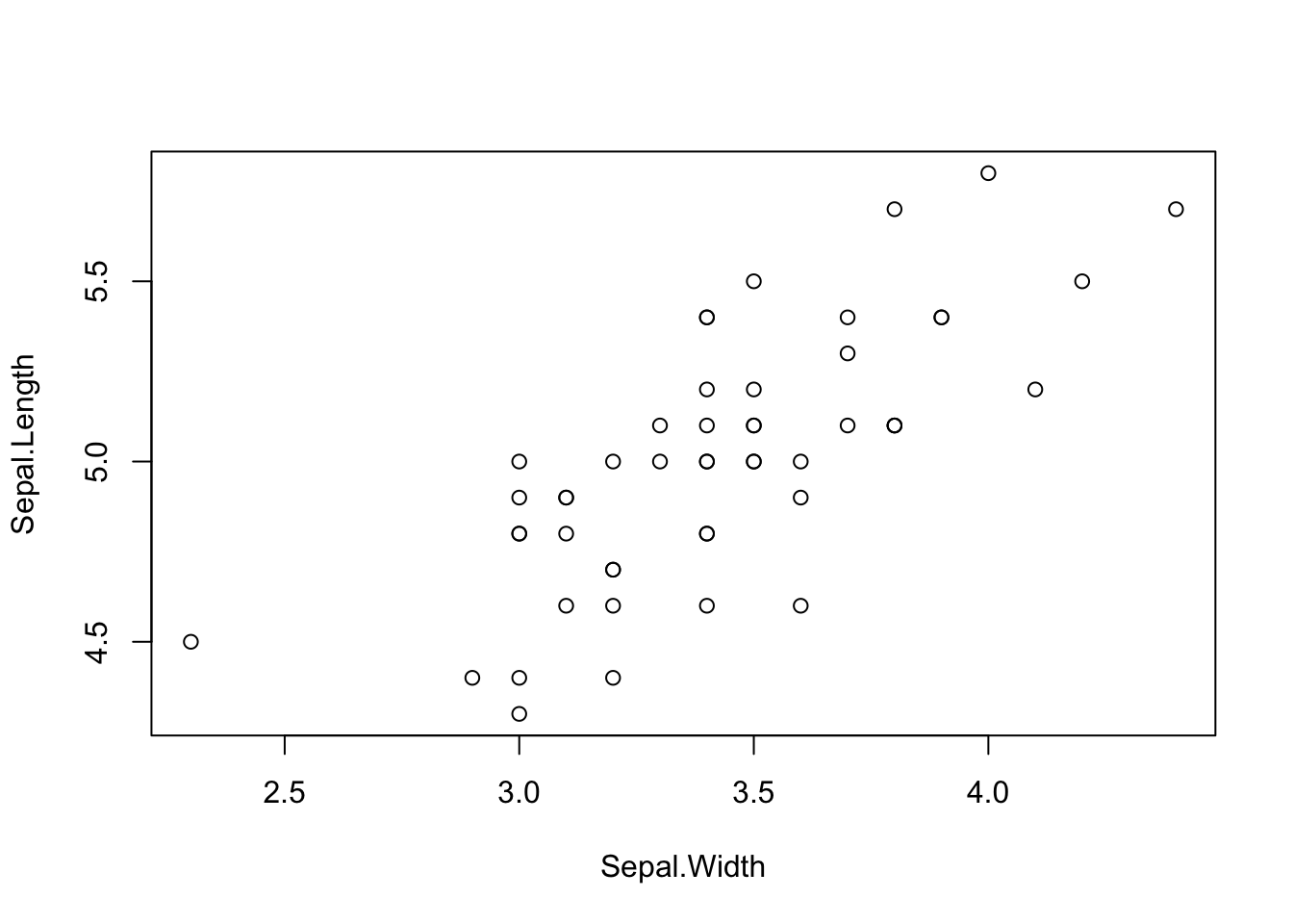
You can customize the plot with various options. See
?par for options.
plot(x = setosa$Sepal.Width, y = setosa$Sepal.Length, pch = 19, col = 'salmon',
     xlab = 'Sepal width [cm]', ylab = 'Sepal length [cm]',
     main = 'Relationship between I. setosa sepal width and length')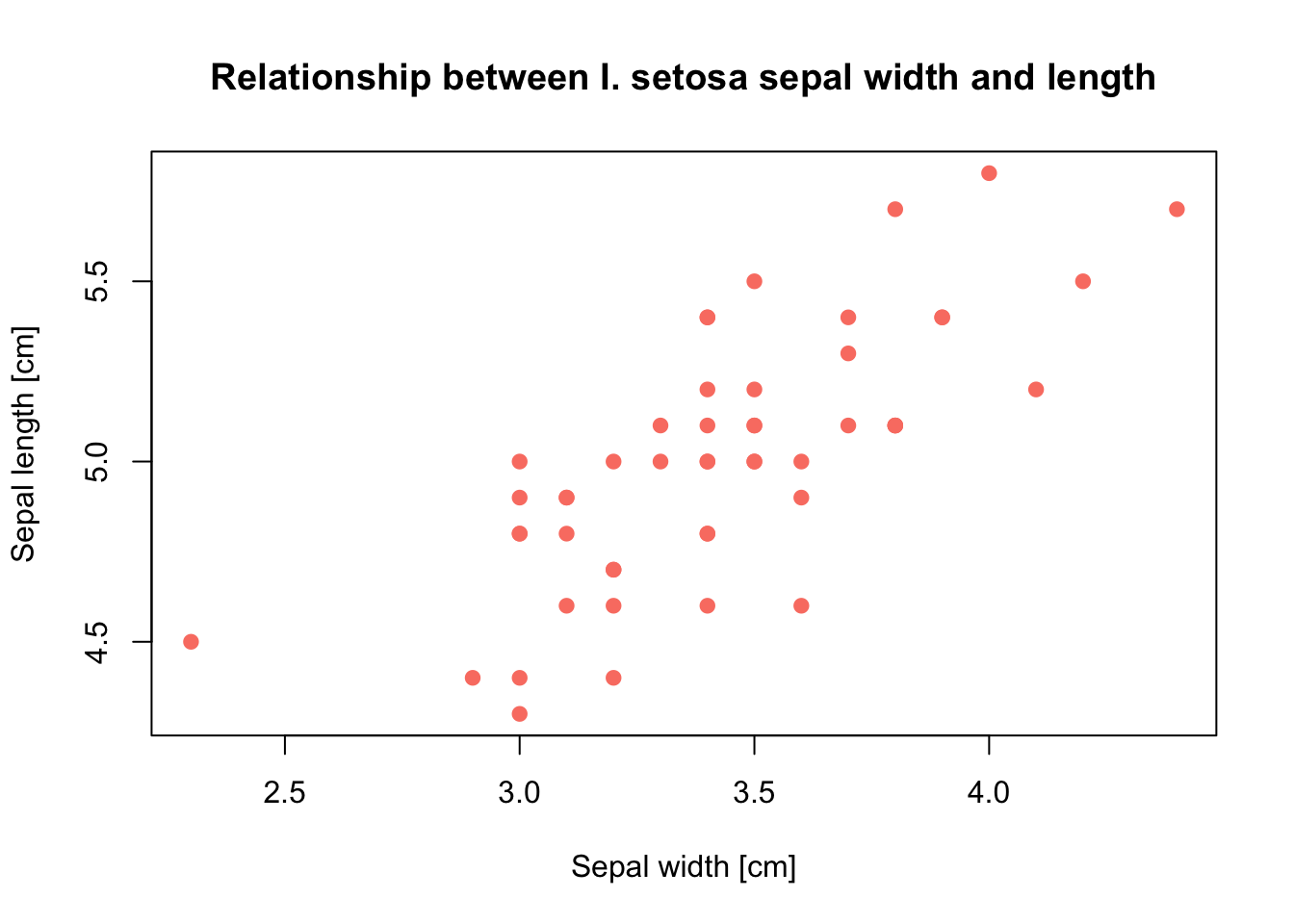
You can change the plot type using the type
argument.
plot(setosa$Sepal.Length, type = 'l')So-called low-level graphic functions let you add certain
elements to existing plots, e.g. lines, labels, legends etc. Also, you
can make mathematical annotations (?plotmath).
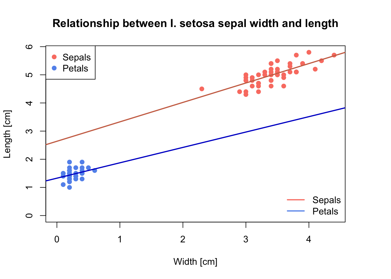
# Set the plot margin size; see "?par"
par(mar = c(5, 4, 4, 4) + 0.1)

plot(x = setosa$Sepal.Width, y = setosa$Sepal.Length,
     pch = 19, # change point symbol
     col = 'salmon',  # change colour of points
     xlab = 'Width [cm]', ylab = 'Length [cm]',
     main = 'Relationship between I. setosa sepal width and length',
     ylim = c(0, max(setosa$Sepal.Length)),  # add y axis limit
     xlim = c(0, max(setosa$Sepal.Width))    # add x axis limit
)

# add regression line
abline(lm(setosa$Sepal.Length ~ setosa$Sepal.Width), col = 'salmon3', lwd = 2)

# add points for petal length and width, and add the corresponding regression line
points(x = setosa$Petal.Width, y = setosa$Petal.Length, col = 'CornFlowerBlue', pch = 19)
abline(lm(setosa$Petal.Length ~ setosa$Petal.Width), col = 'blue3', lwd = 2)

# add legend in the topleft corner
legend("topleft",
       legend = c("Sepals", "Petals"),
       col = c("salmon", "CornFlowerBlue"),
       pch = c(19, 19))

# add legend in the bottomright corner - what are the differences to the previous?
legend("bottomright",
       legend = c("Sepals", "Petals"),
       col = c("salmon", "CornFlowerBlue"),
       lwd = 2,
       bty='n'
       )
Histograms and boxplots:
# open a new graphic device. Use the function matching your system and disable the others by commenting them out using '#'.
quartz(w = 6, h = 6) # MacOS

windows(w = 6, h = 6) # Windows

x11(w = 6, h = 6) # linux


hist(setosa$Sepal.Length)

# create a boxplot for the entire iris data set to show the Sepal length of each species
boxplot(Sepal.Length ~ Species, data=iris)
Test it yourself
- Load the data set “Orange” using
data(). Plot circumference against age of the Orange trees. - Use a triangle as the plotting symbol (defined using the argument
pch). Check out the help page?pointsto find out whichpchnumber corresponds to a triangle. Plot green triangles. - Add a regression line to the plot.
2 Plotting with
ggplot2
ggplot2 is a visualisation library that allows more
elegant and versatile plotting. It follows quite a different philosophy
than base graphics. Plots are built step by step. This basic template
can be used for different types of plots:
ggplot(data = <DATA>, mapping = aes(<MAPPINGS>)) + <GEOM_FUNCTION>()
library(ggplot2)The ggplot() function binds the plot to a specific data frame using the data argument.
ggplot(data = iris) # this provides a blank ggplot objectUsing the aesthetic function aes() we can define the
geometric and statistical objects (color, size, shape, and
position).
p <- ggplot(data = iris, mapping = aes(x = Sepal.Width, y = Sepal.Length))Using the geom_ functions, we can add the geometric
shapes representing the data, e.g.: - geom_point() for
scatter plots, dot plots, etc. - geom_boxplot() for
boxplots - geom_line() for trend lines, time series,
etc.
p + geom_point()# you can also do it in one go
ggplot(data = iris, mapping = aes(x = Sepal.Width, y = Sepal.Length)) + geom_point()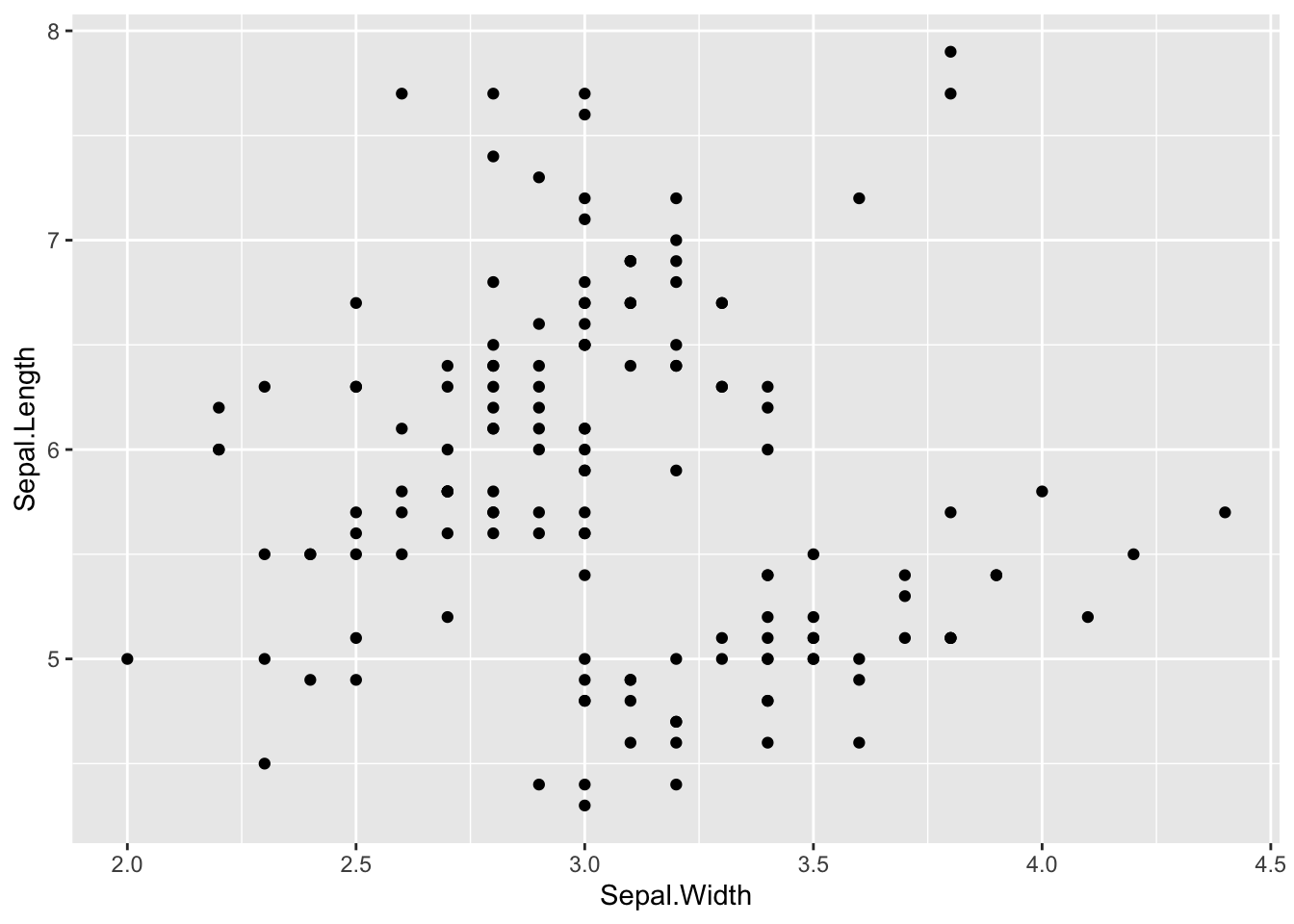
Test it yourself
- Use the
ggplot2functions to plot circumference against age of the Orange trees as you did above.
We can modify this plot by adding colours, transparency etc.. Note
that if you want to make the colour, shape etc. dependent on the values
in your data, the arguments must be specified within the
aes() function. To specify a colour, shape, etc. for all
data points, regardless of their value, the argument must be given
outside of aes().
p + geom_point(color = 'salmon') # color specified outside of aes-function to set one value for all data points

# add transparency:
p + geom_point(color = 'salmon', alpha = 0.5)

# assign different colours to different Iris species
p + geom_point(aes(color = Species)) # color specified inside of aes-function to map color values to the data
# assign different symbols to Iris species:
p + geom_point(aes(color = Species, shape = Species))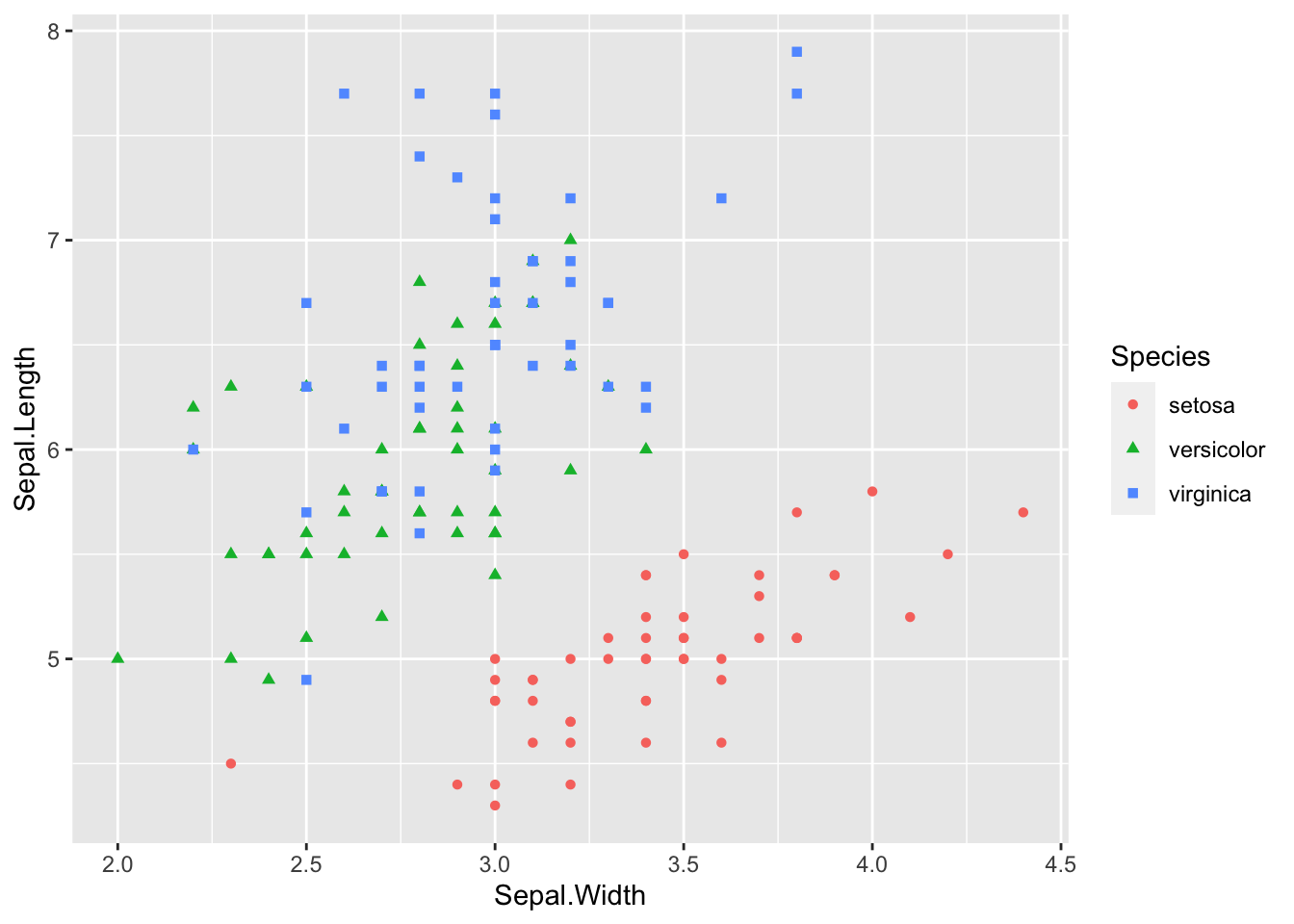
Add a linear model or Loess smoother (only I. setosa):
# regression line:
p <- ggplot(data = setosa, mapping = aes(x = Sepal.Width, y = Sepal.Length))
p + geom_point() + geom_smooth(method="lm")
## `geom_smooth()` using formula = 'y ~ x'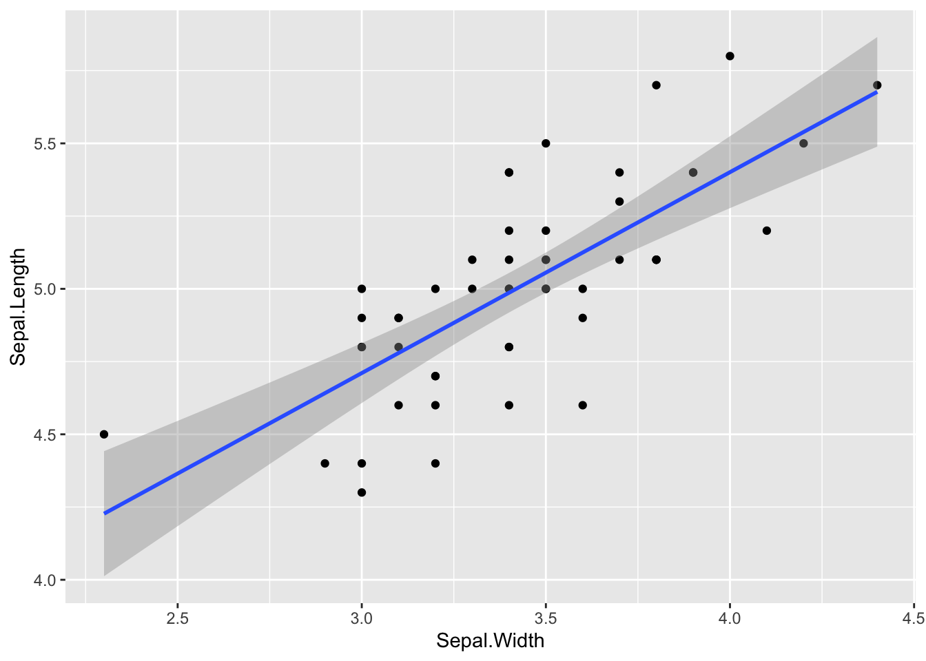
# smoother:
p + geom_point() + geom_smooth(method = "loess")
## `geom_smooth()` using formula = 'y ~ x'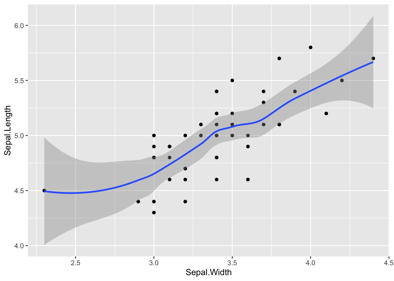
Boxplot:
ggplot(data = iris, mapping = aes(x = Species, y = Sepal.Length)) +
  geom_boxplot()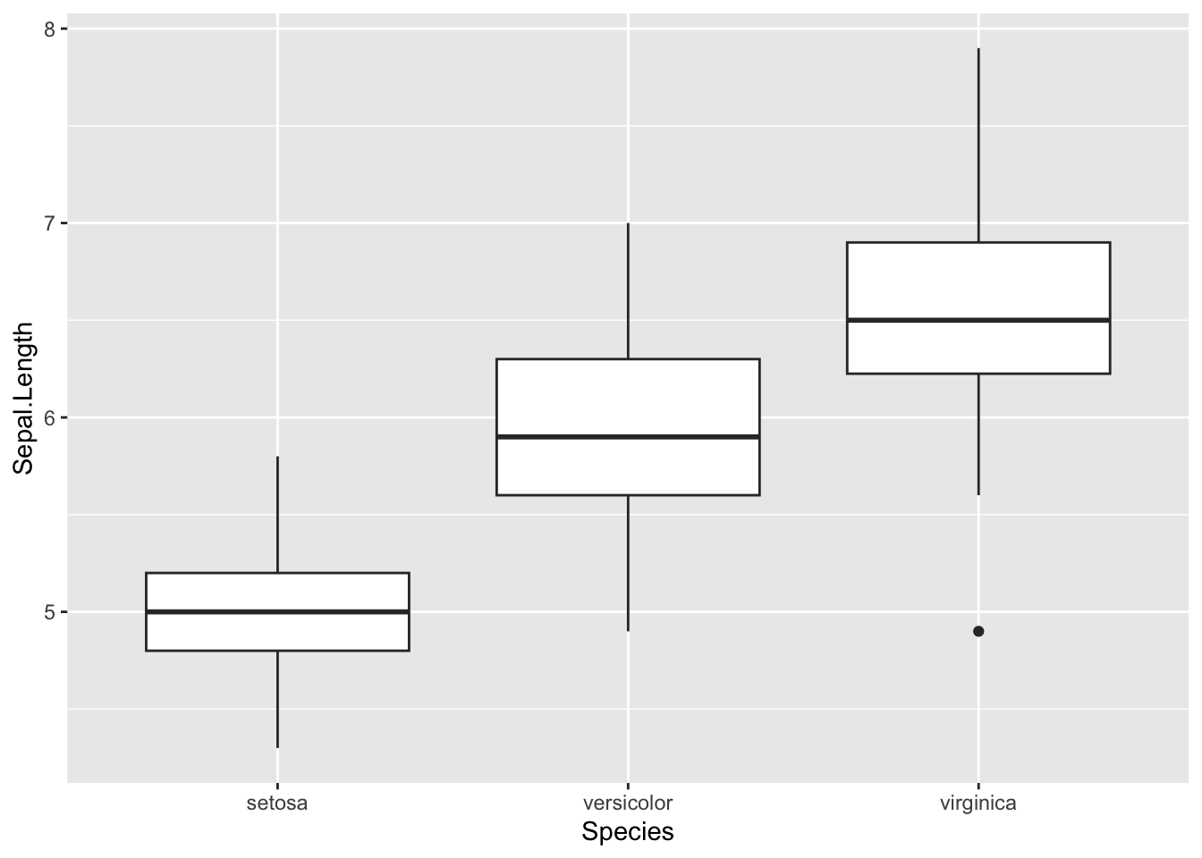
Exercises:
Task 1: Use the Iris data set
- Create a subset for I. versicolor and plot correlation
between petal width and length with base r graphics. Include a
regression line and make sure axis titles are meaningful.
- Add points for I. setosa and I. virginica. (hint: when you add
values the x and y-axis range isn’t adjusted and some values might not
be shown. Adjust the x and y axis ranges to make sure all values are
shown. Use the
ylimargument in theplot()function for this.) - Add a legend
Task 2: Take a look at the built-in data set
ChickWeight. Plot the results of the experiment in a way
that shows the potential effect of diet on the early growth of chicks.
Hint: use a boxplot!